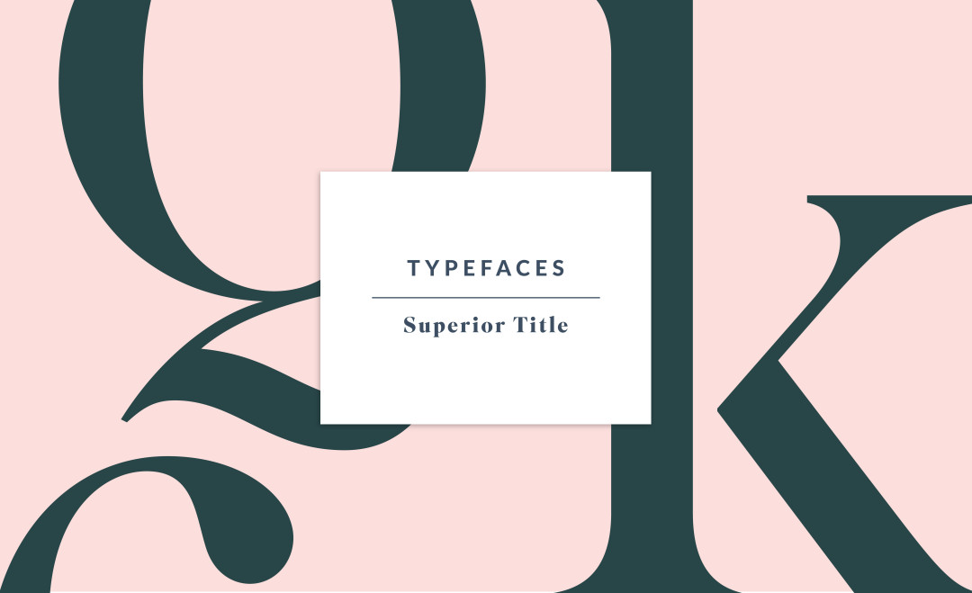
Another great typeface I had the chance to work with recently is Superior Title by MCKL. MCKL is a Minneapolis-based type foundry and design studio run by Jeremy Mickel. They offer a library of retail fonts, as well as providing custom typefaces, lettering, and logos, for corporate, publishing and design industry clients.
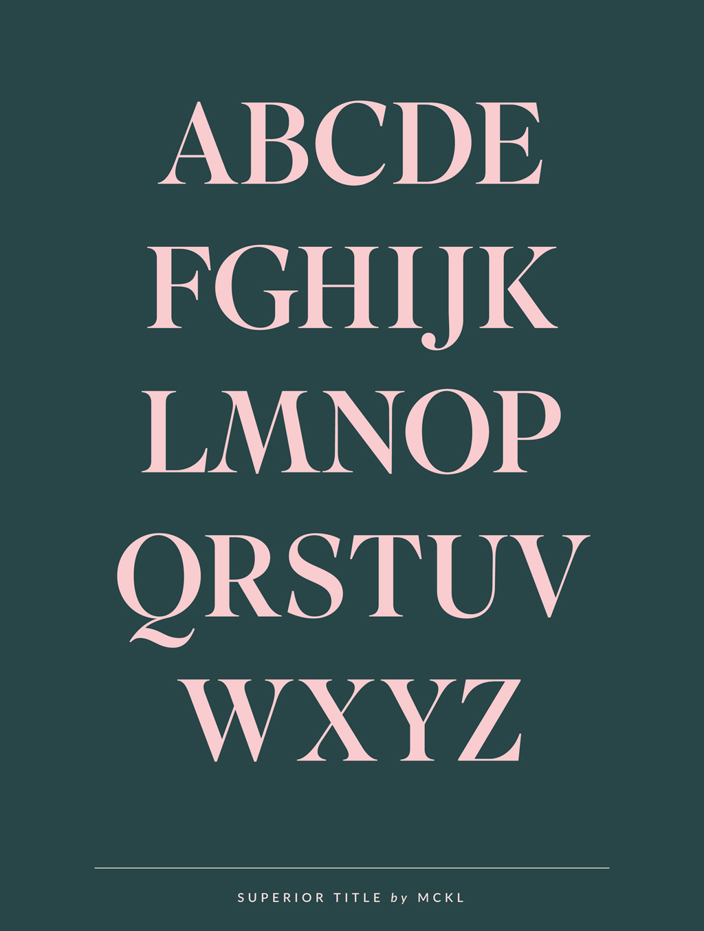
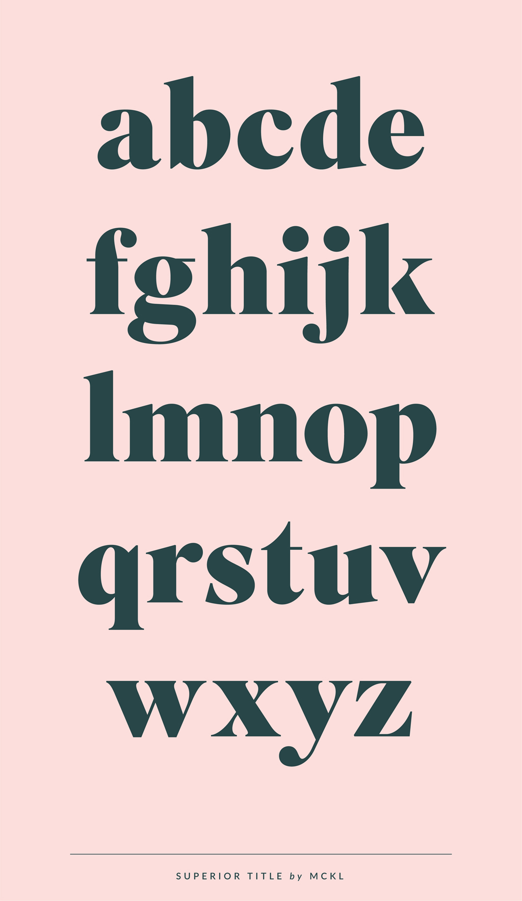
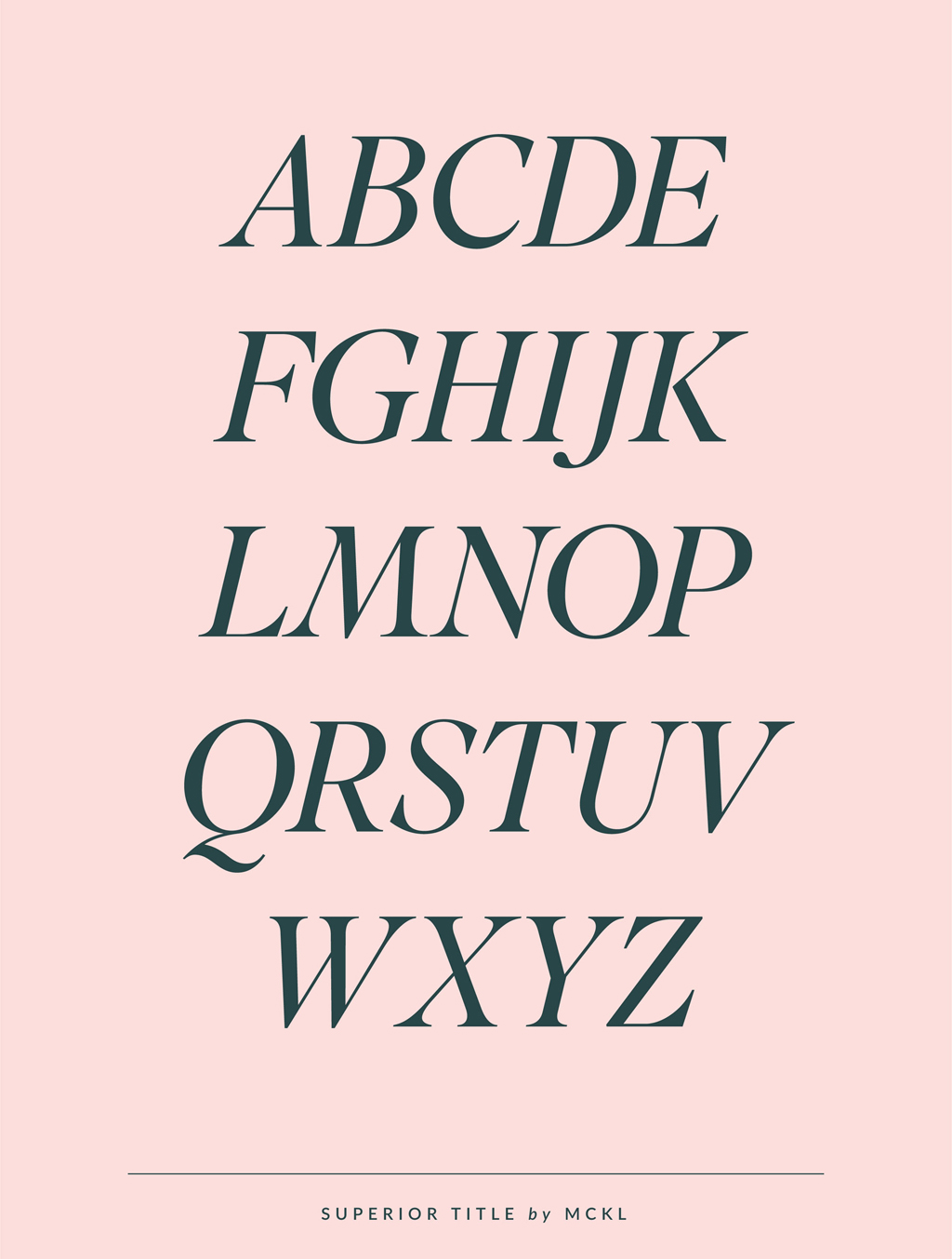
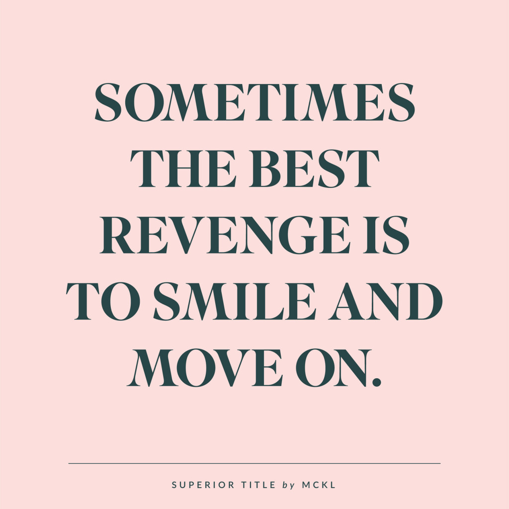
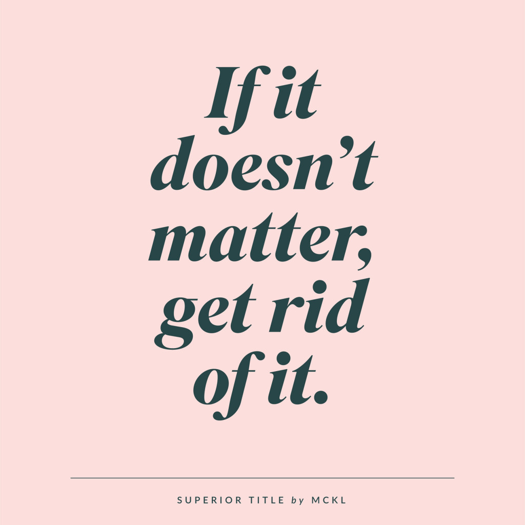
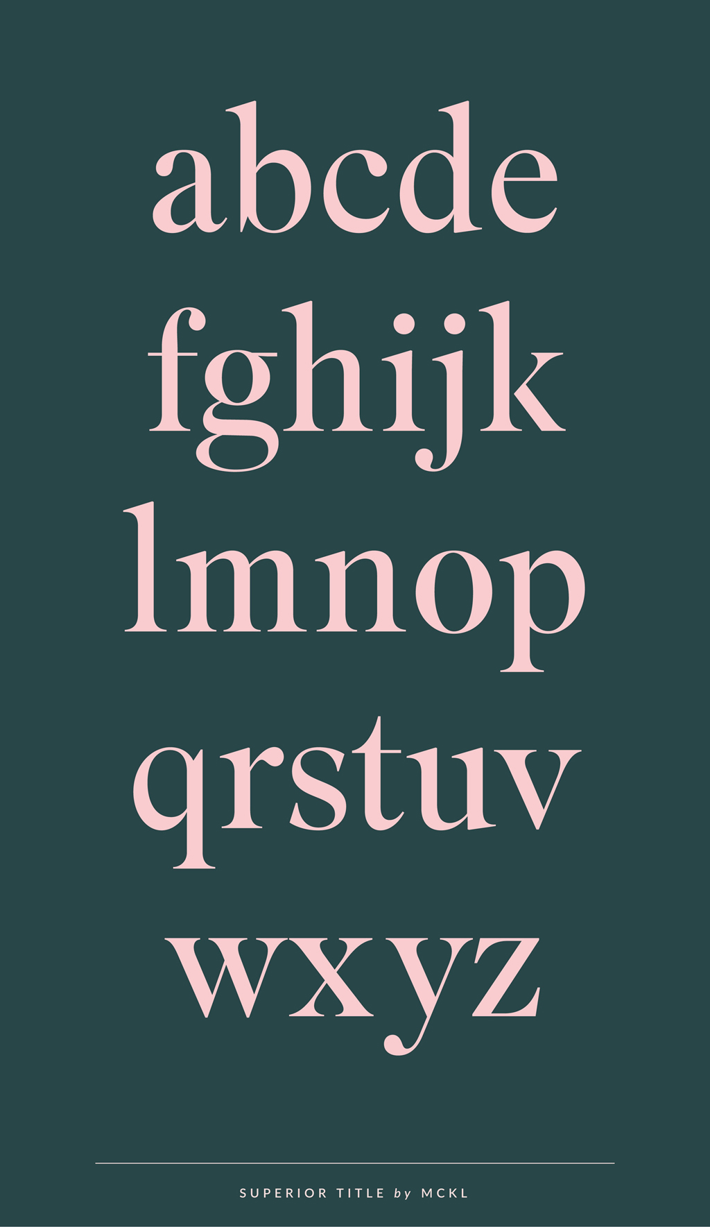 Superior Title is a high contrast Transitional typeface, a kind of missing link between Bodoni and Times. The family takes inspiration from naïve American titling faces from the early 20th century, as well as phototype fonts from the 1970s. The Display styles are suitable for editorial usage, particularly for fashion and lifestyle publications.
 Superior Title is available in five feature-rich weights in Roman and Italic with built-in swash alternates & small caps. You can purchase the typeface through Village.


18 Comments
Oh my ! This typeface is so classy and gorgeous. I love how it works beautifully with the colors you’ve used here too.
Thank you so much Zakkiya and welcome to the blog!
This is spectacular!! Going to the top of my font wishlist right now. 😉
Hi Irene, nice to meet you! Yes, it’s really a special typeface, but still timeless. If you have any other favorites right now, let me know, I’m always searching for new ones.
What a beautiful typeface. Also, you’ve done a great job of showcasing the font!
Thank you for your kind words Tiffany, I’m happy you like it!
Ooo. love this post!! Such a great font! Had to pin your quotes!!
Hey Lizbeth, thank you so much, it’s great to hear that 😉
Stunning pieces of typography!
They really are, I love working with this typeface!
This is absolutely beautiful and elegant! The letterforms and colors are lovely
I am so happy that you like the typeface!
gorgeous typeface. wow. love the lowercase.
Yes the lowercase are super nice here! Working with them is really great.
Superior cool 😉 Especially liked in bold italic type. Very suitable for styling citations and frame small blocks of text.
That’s true, and it’s a very versatile typeface that still looks special. Happy you like it!
Loving this type so much! Congratulations! Just came here from a photo on Pinterest and all your work seems amazing.
Oh thank you very much Victoria, this is always so good to read 🙂