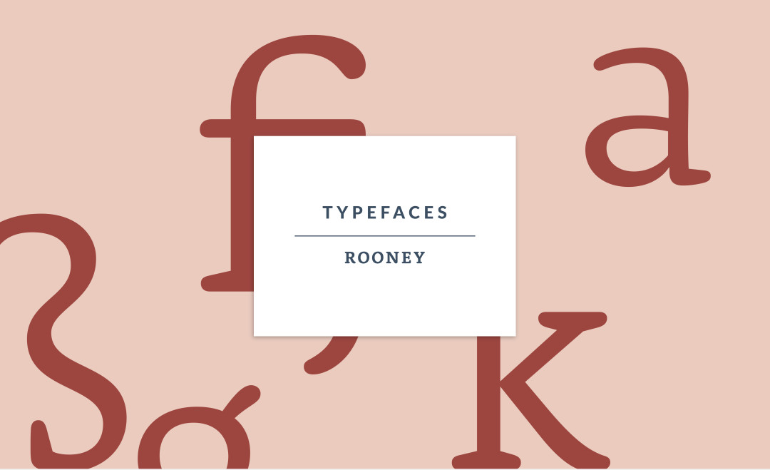
ABOUT THIS FONT FAMILY
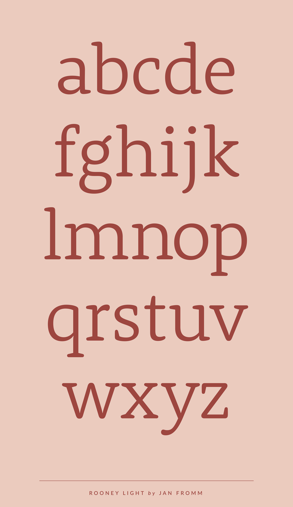
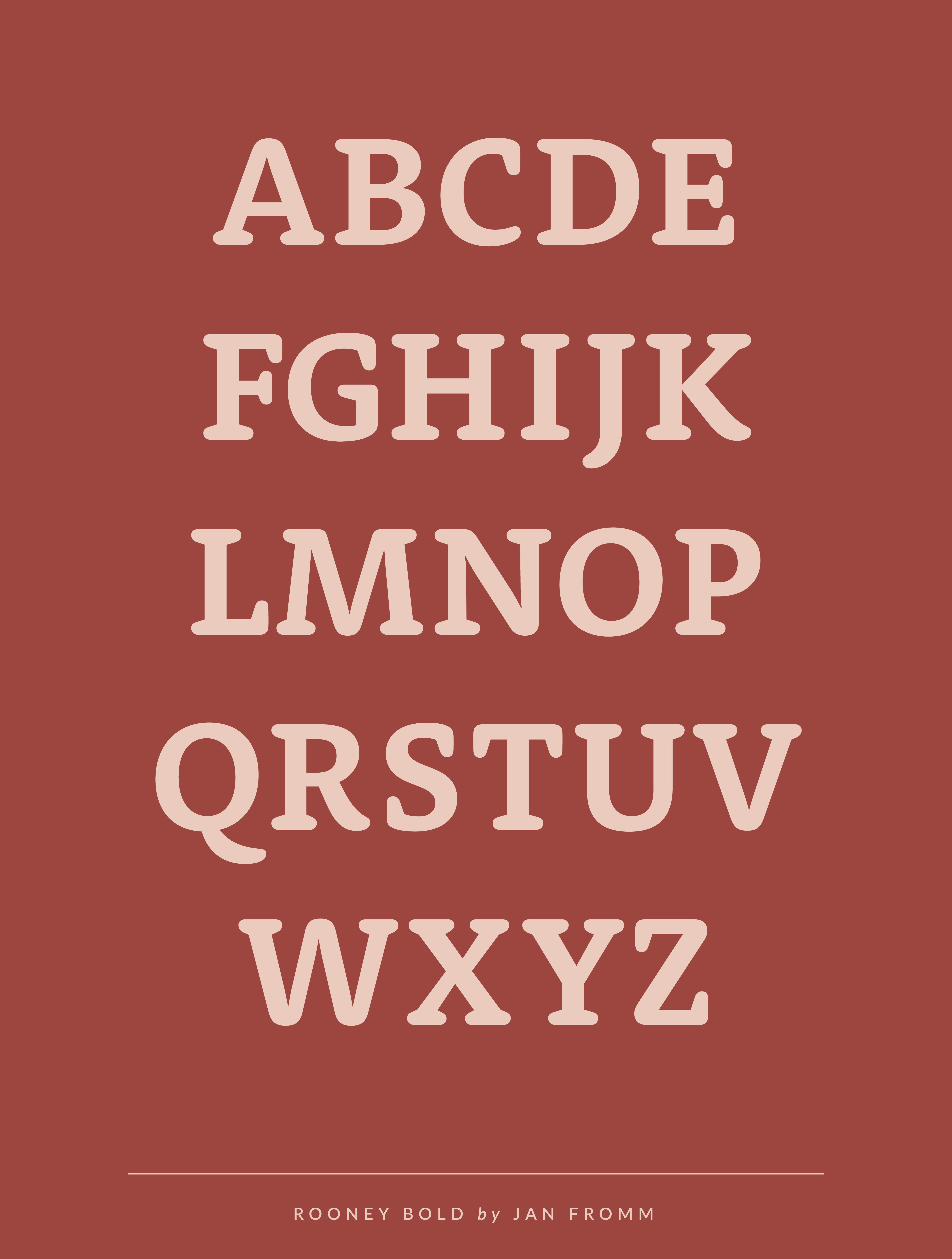
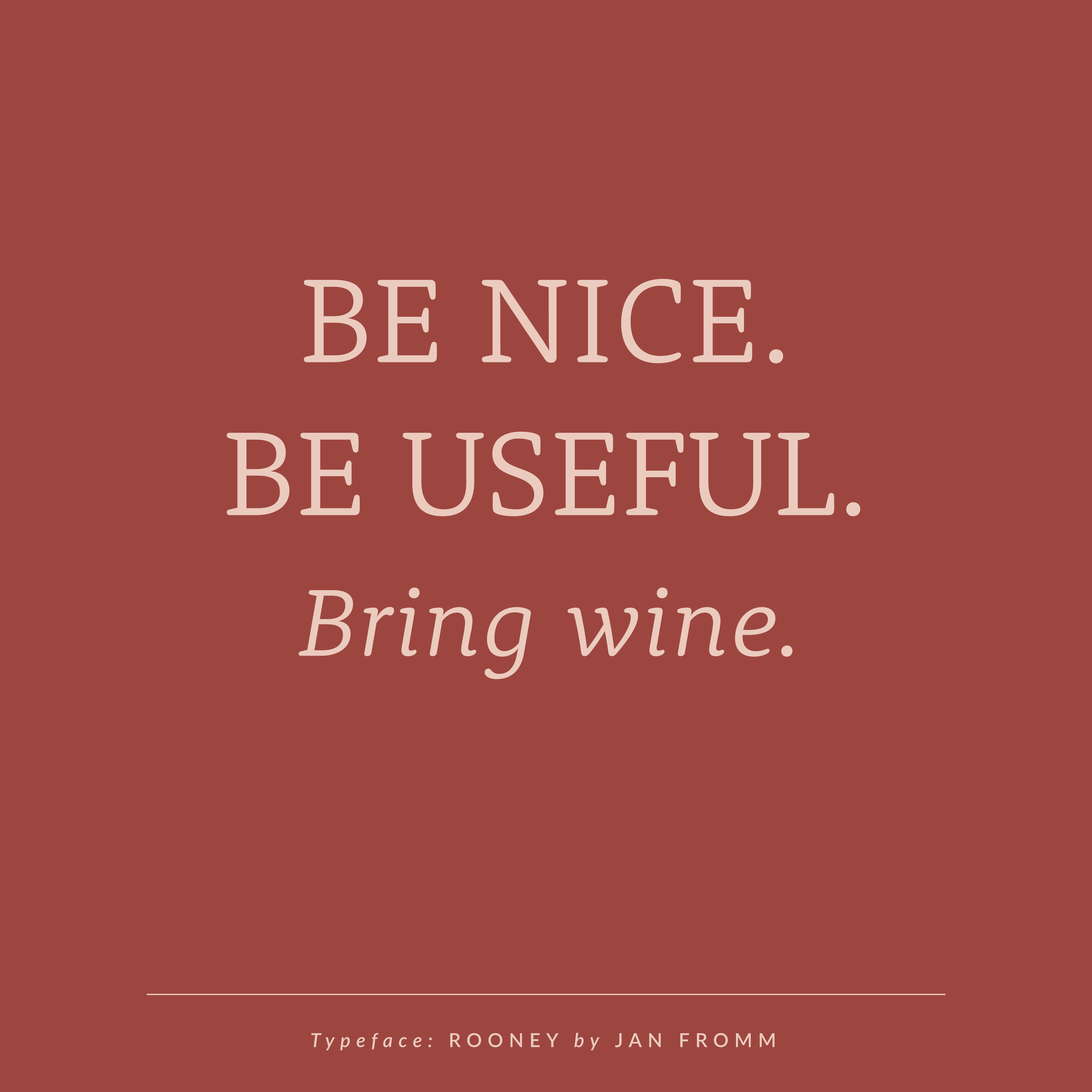
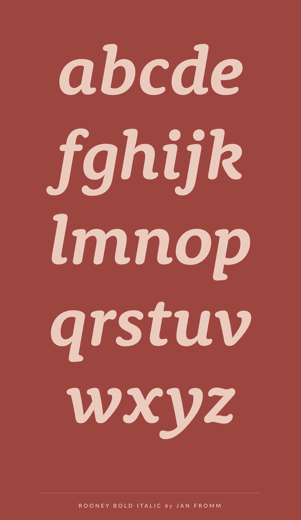
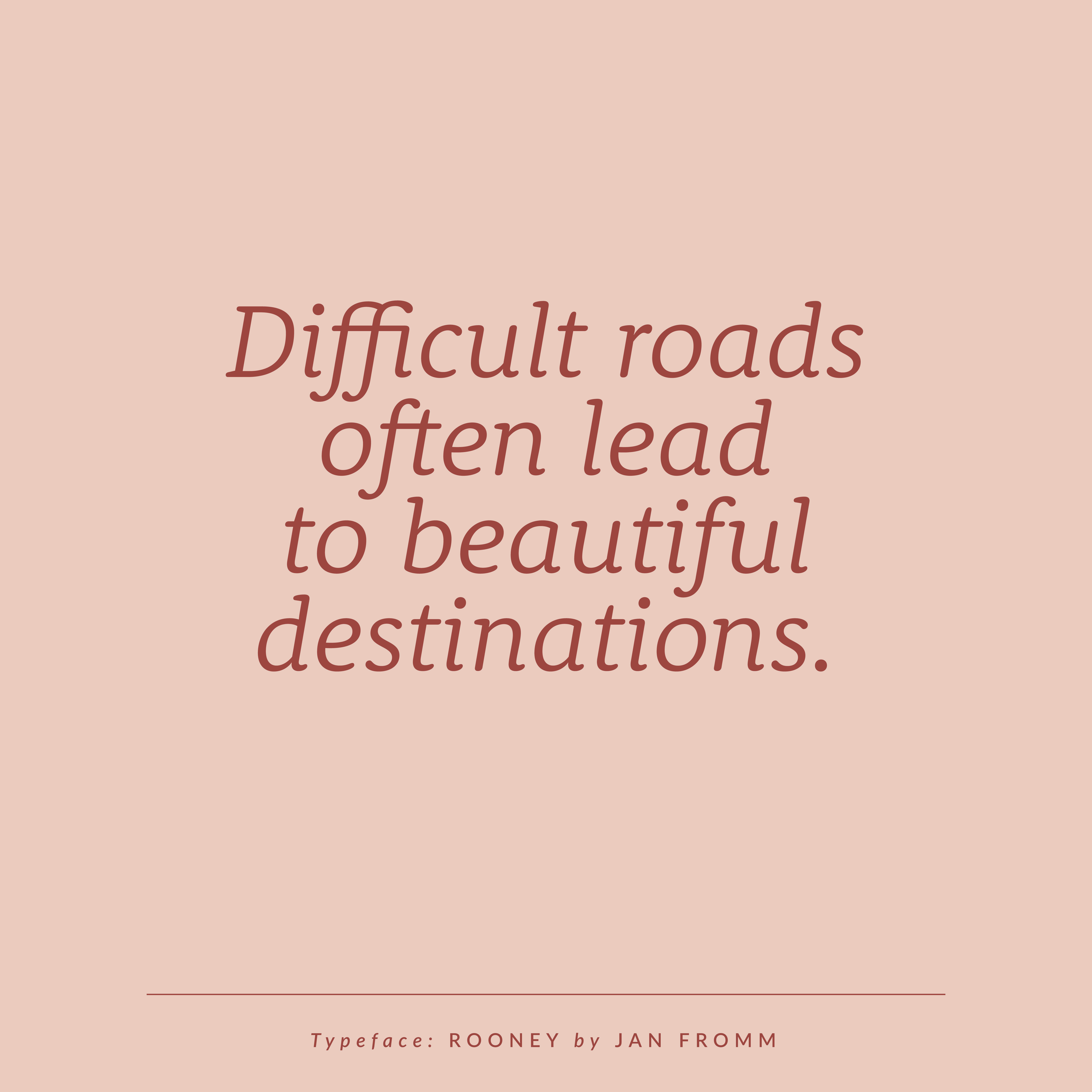
Today I’m showing you a font family that is quite different from the previous ones: Rooney is a serif typeface with a very warm and friendly feel. The idea behind it was to create a rounded typeface without getting a too playful look. The rounded shapes and soft curves add a warm and smooth impression. Thanks to old-style serif construction principles, such as the angle of stress, the open letterforms and the medium contrast, Rooney still evokes a serious feel. The typeface is very versatile. Distinctive, original letterforms create a strong impression in large headlines, while text set in smaller sizes is readable as well.
ROONEY IS AVAILABLE IN SEVERAL WEIGHTS AND VERSIONS
Rooney includes six weights from Light to Black and Italics and is also available in a Pro and Web version. Rooney Pro is the best choice for all designers: It contains lots of typographic features such as small caps, ligatures, different figure sets and alternate glyphs. Rooney Web is optimized for use on websites and on-screen reading. It is available on Typekit!
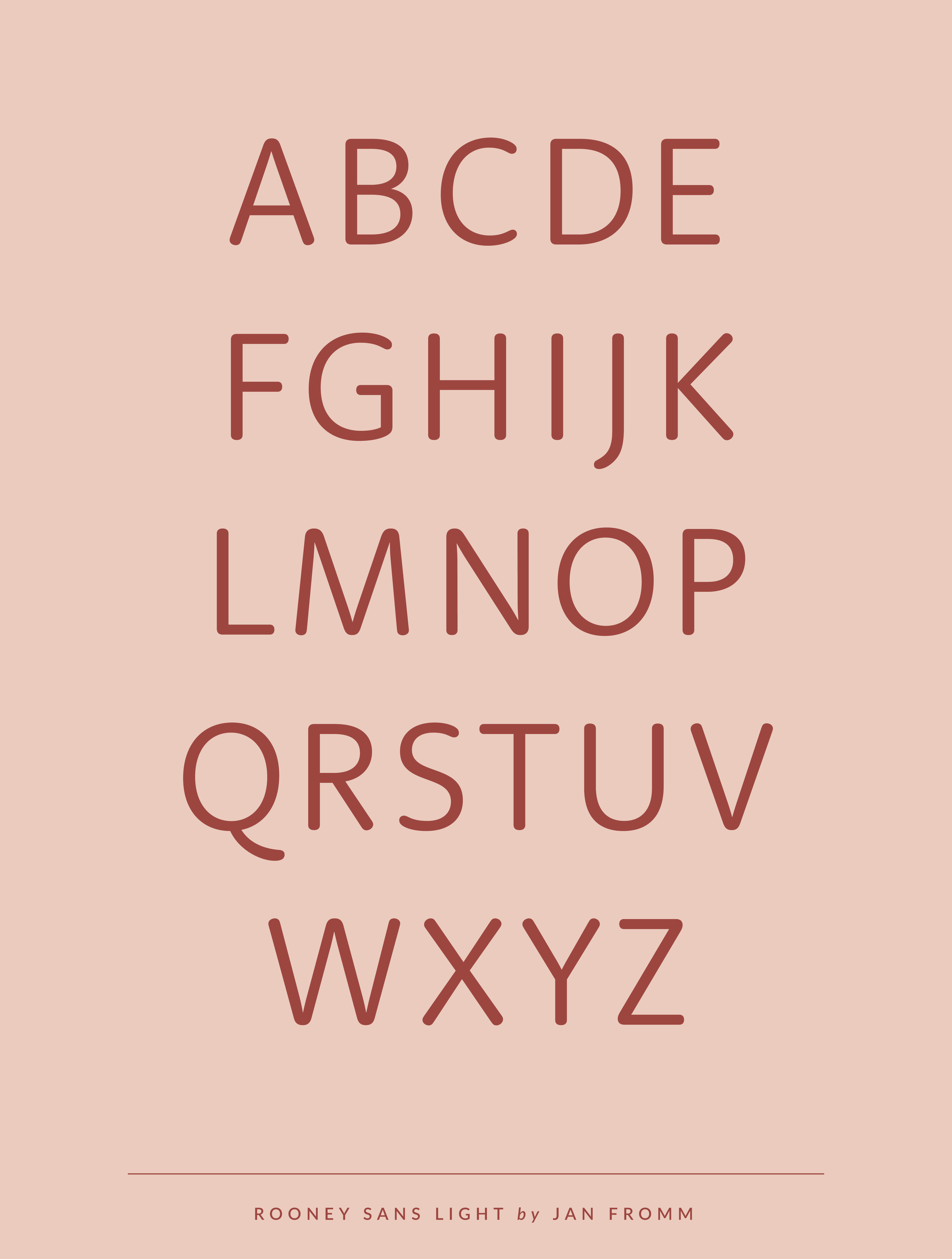
If you are looking for a sans-serif typeface, don’t worry, Jan created a sans-serif version as well. It is called RooneySans and is the perfect companion for the serif version! Both typefaces share the same great attributes and work really well together.
ABOUT JAN FROMM
Jan Fromm is a German graphic and type designer. He studied at Potsdam University of Applied Sciences where he also developed his passion for typography. Since 2003 he is working on web and screen-based design projects and as a freelance type designer. Currently Jan is living in Berlin.


4 Comments
This is nice! I like the connections between letters.
The ligatures are really nice, you’re absolutely right!
Love it! This is an excellent balance between professional and charming – such a hard chord to strike.
That’s so true and that’s also why I love this type so much! Thanks for stopping by Hannah!