Today I’d like to introduce you to my new column “Typefaces”. Choosing the right typefaces for a branding or editorial project is one of my favorite parts. It’s probably also the most difficult, which only makes it more interesting. Over the years I found a lot of great foundries with excellent typefaces and I would really love to share all my favorites with you!
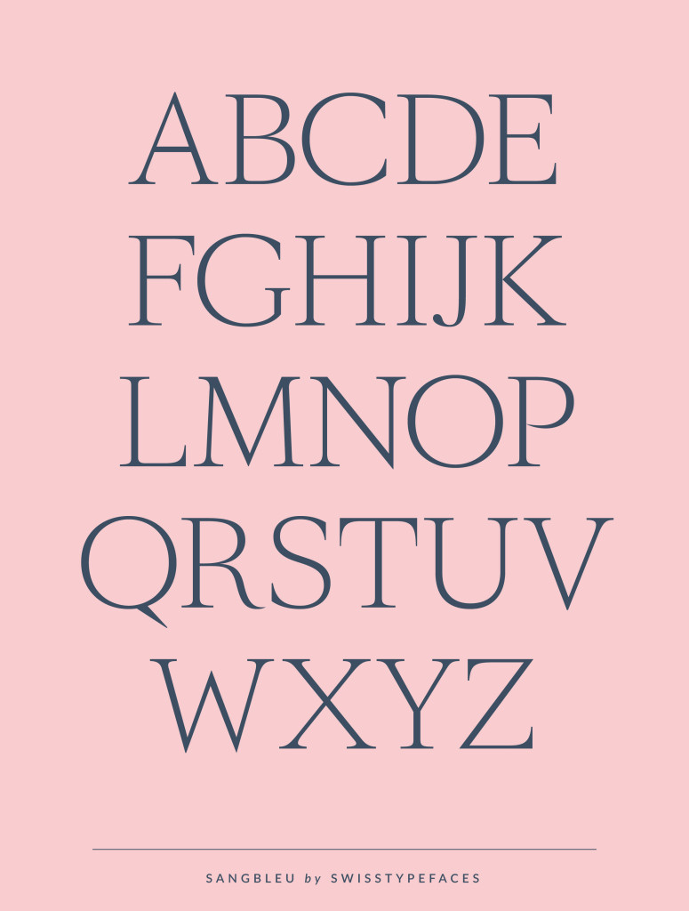
This first post is about SangBleu, a set of fonts by Swiss Typefaces. The designers Maxime Buechi and Ian Party, both based in Lausanne, Switzerland, launched this foundry in 2006. All of their fonts are inspired by the history of French typography and reinterpreted in a very modern way.
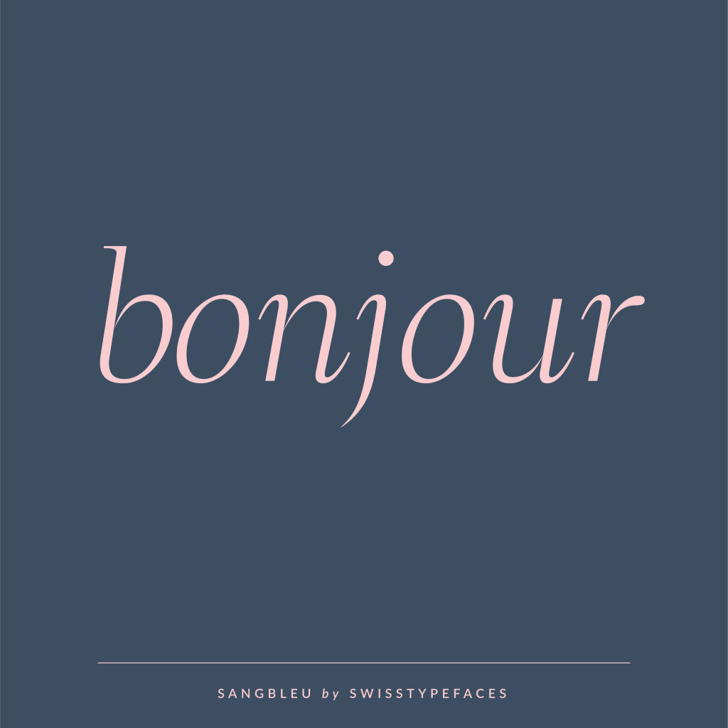
SangBleu is a headline family in two differents versions, Serif and Sans Serif. Currently Swiss Typefaces is working on a redesign of SangBleu and Romain. Both families will be merged in one under the name of SangBleu. This new collection will be released in 2017 and will also include webfonts.
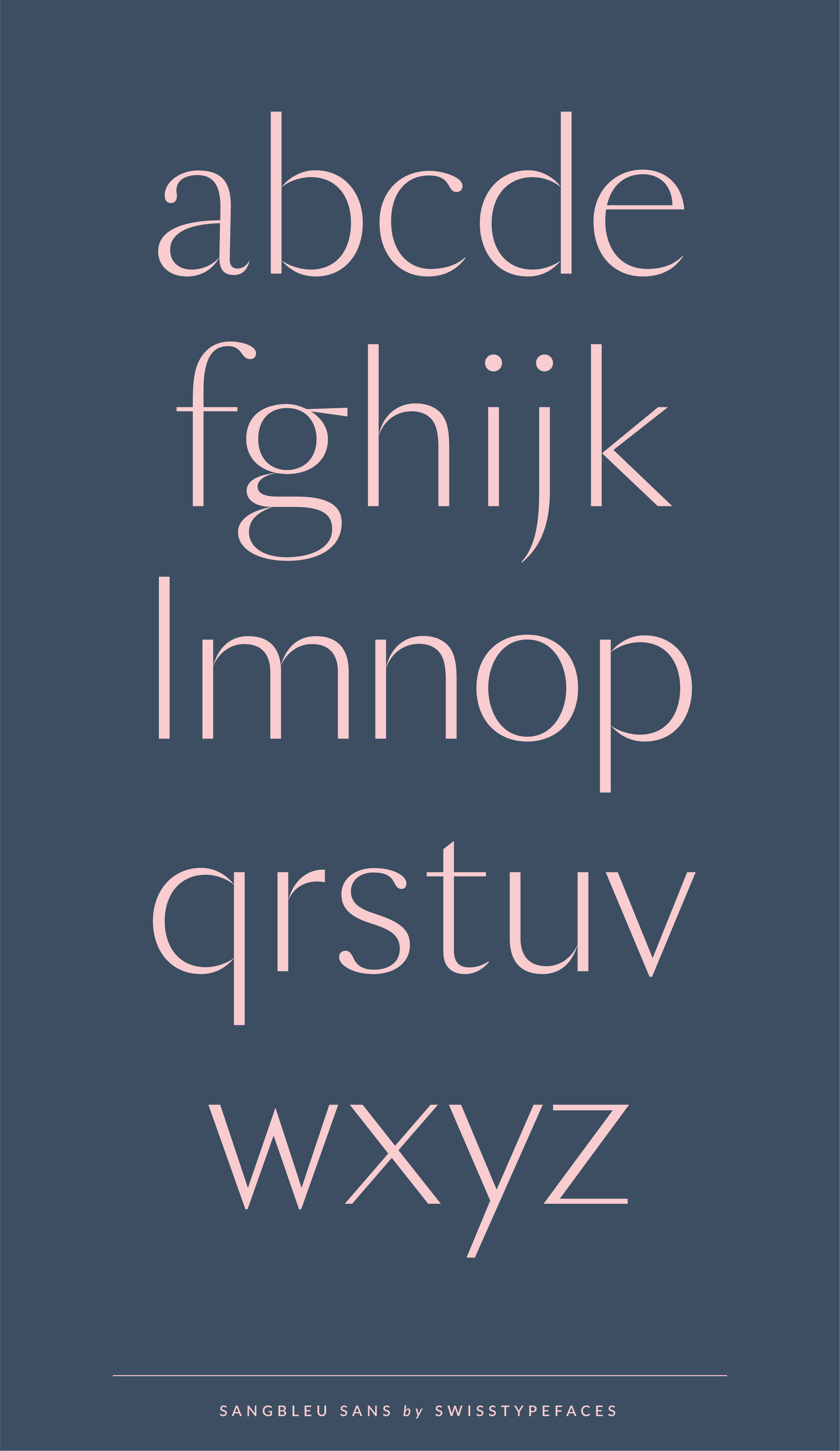
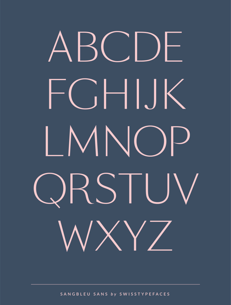
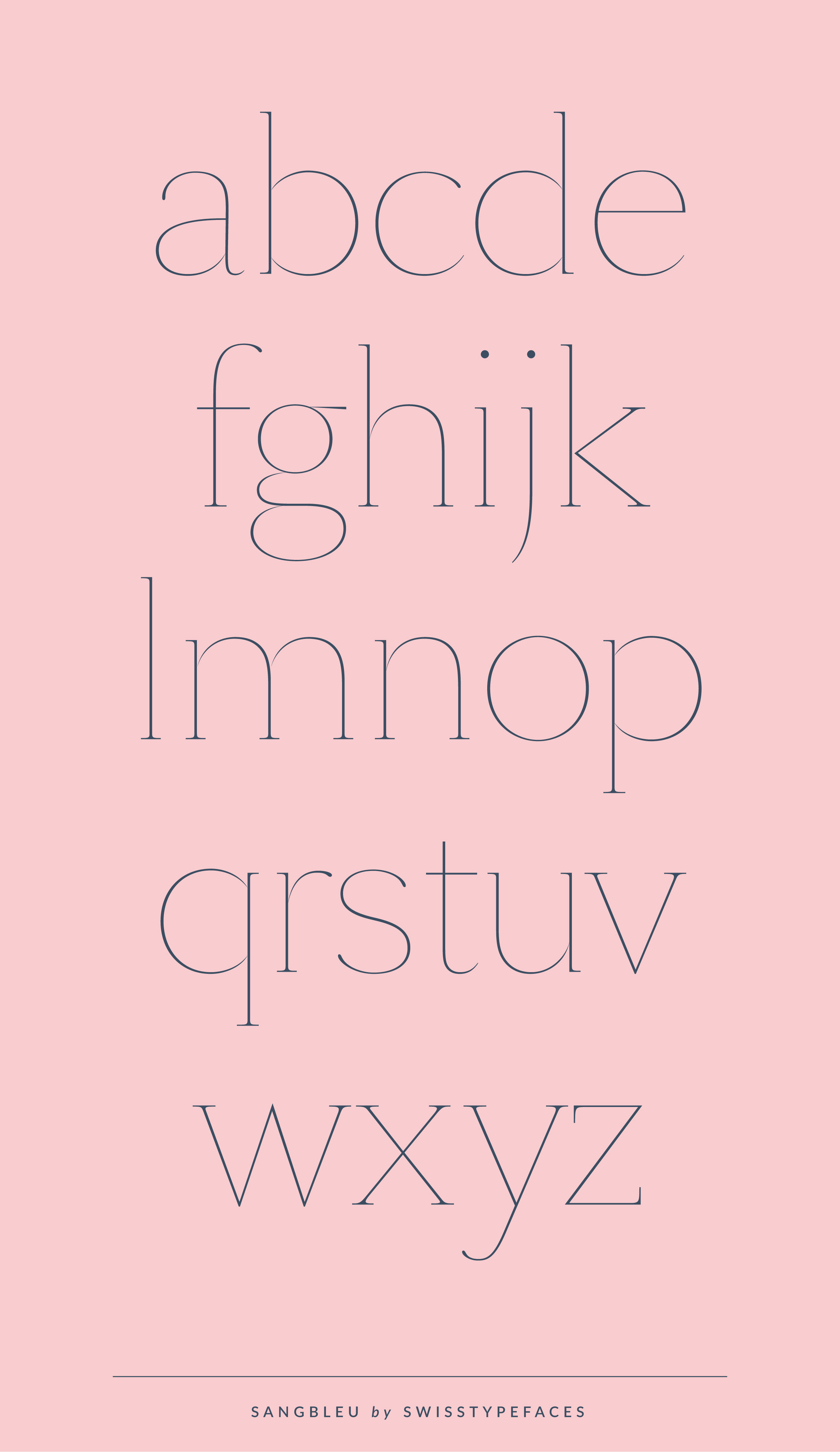
SANGBLEU IN USE
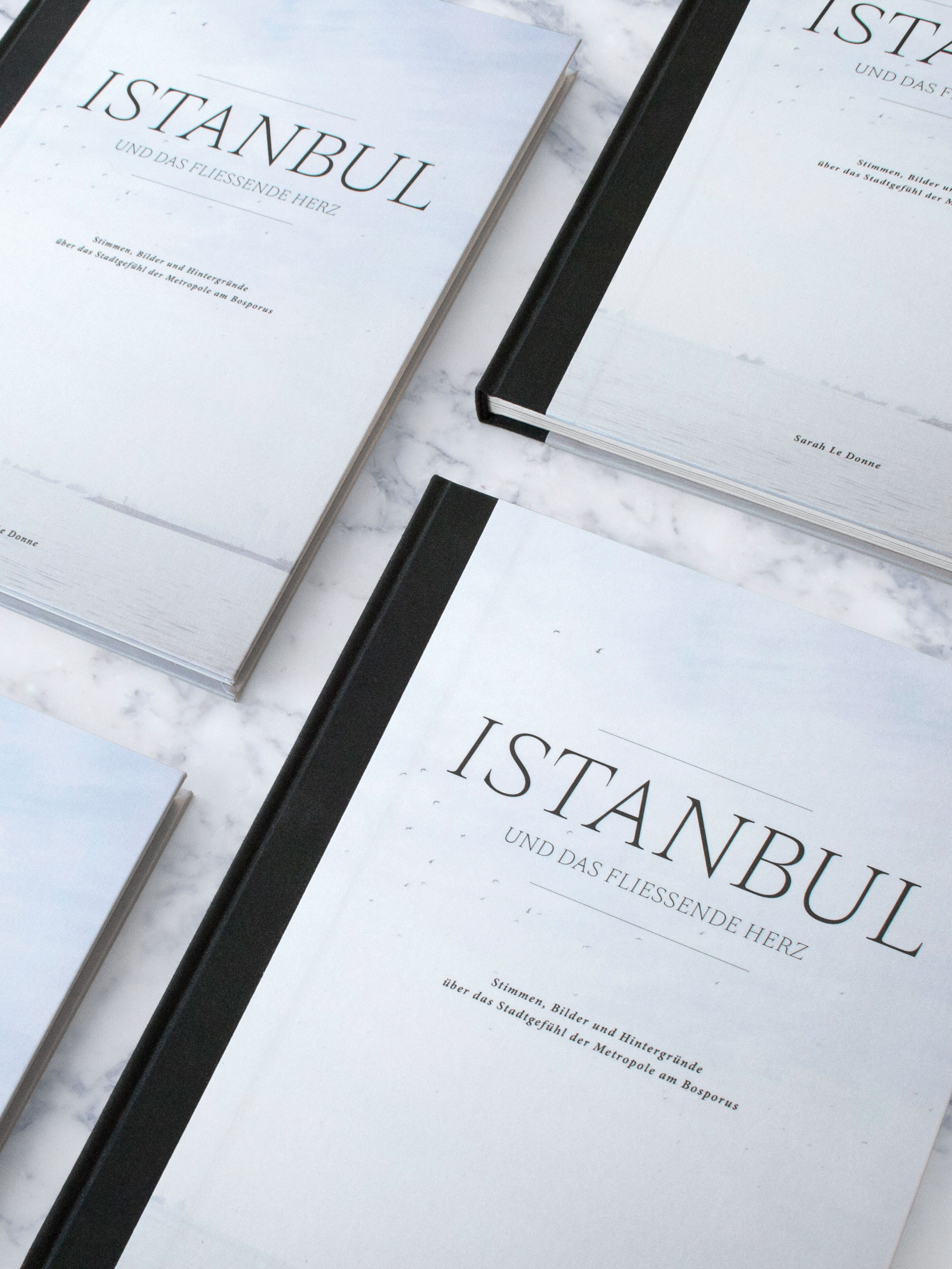
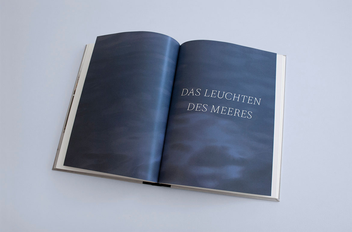
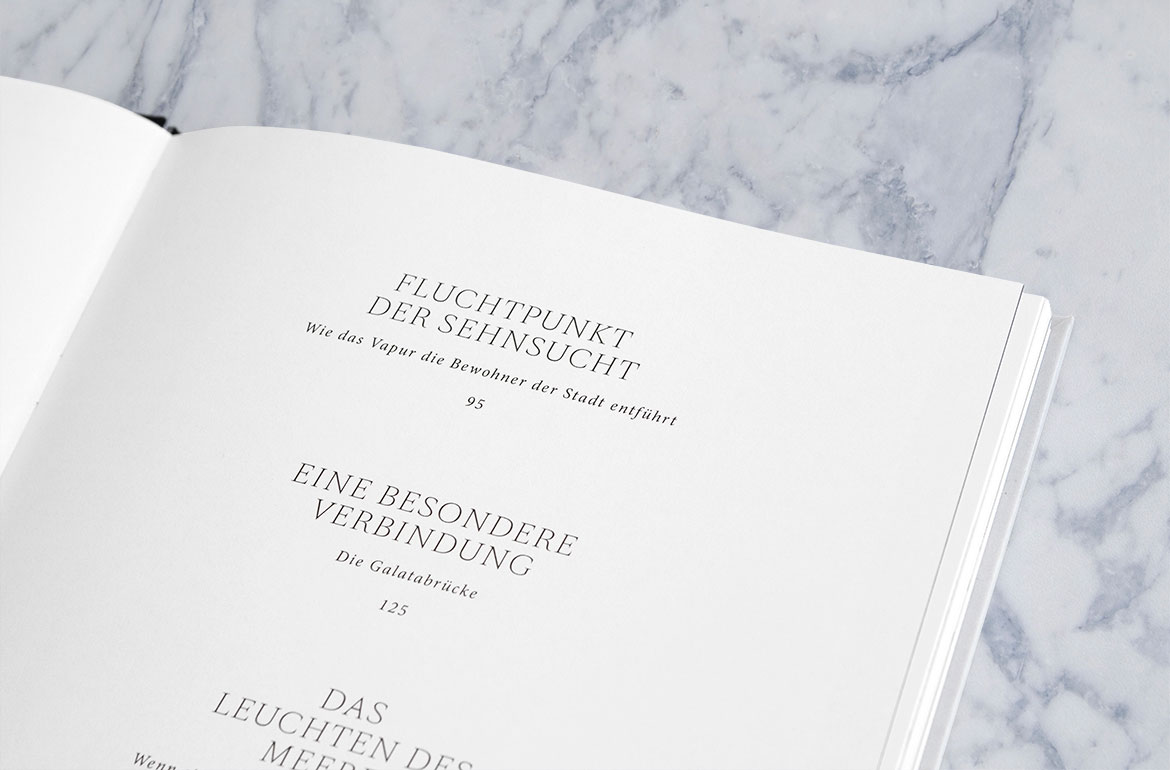
I found SangBleu when I was searching the perfect font for my Bachelor thesis (back in 2012, time flies!). When I saw the typeface I immediately knew that my search was over, it was simply perfect for my Istanbul book!
FREE TRIAL FONTS
Swiss Typefaces is offering free trial fonts on their website! With the download you get a reduced version of the respective font, that includes full latin upper- and lowercases with basic punctuation. Perfect for testing and getting a feeling for a type you’re intersted in.



2 Comments
The fonts are wonderful. I would prefer to buy and use them.
I googled Sang Bleu and its French for blue blood aka royal blood I guess.
That makes perfect sense and I am so using this for a current woman fashion brand we are currently developing.
I am in love with Sang Bleu Sunrise !